
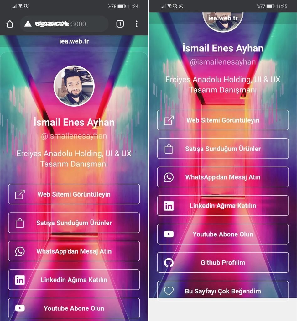
When designing mobile-friendly web pages, I usually prefer to fill the backgrounds with images, colour transitions and videos.
When I want to put a full screen image in the background, height: 100%; I take advantage of the flexibility feature of the css code.
Problem:
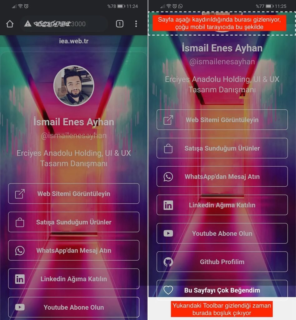
While there is no problem on desktop devices, when the page scrolls down on mobile devices, the address bar (toolbar) is hidden and 10% more space is added to the page.
The picture that covers 100% of the background, suddenly jumps, narrows and a white space appears in the lower area, I have examined many websites, they preferred to leave this problem as it is.
Solution:
Using viewport units offers many solutions for flexible views on mobile devices.
https://bbg0x.medium.com/css-yeni-viewport-vw-vh-vmin-birimleri-b6f9b1e92d3f
height: 100vh; You can solve the jump and white space problem by using the code as follows.